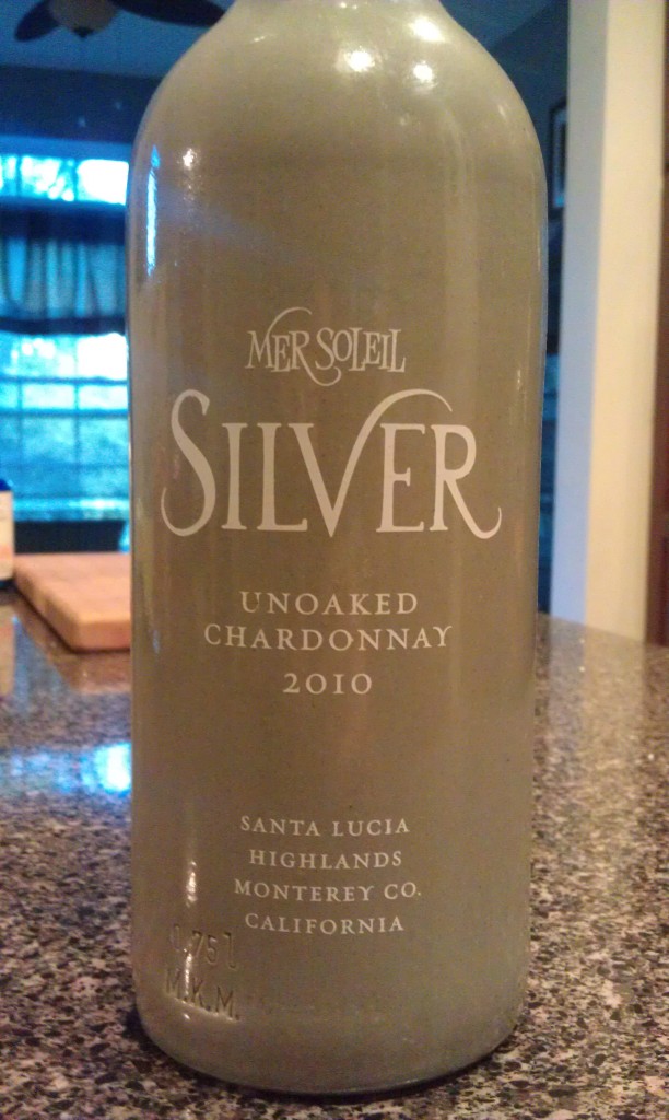
Varietal:Â 100% Chardonnay
Region:Â Santa Lucia Highlands – Monterey – California
Cost:Â $17
Winemaker’s Notes:Â Mineral driven nose with citrus shining through. Cement tank fermentation and aging bring out aromas remindful of the first rain of the season or a wet rock. Soft and round entry with an acid backbone informs you these grapes are grown in a cooler climate. Mid palate reveals ripe fruit such as lemons, gooseberry, and grapefruit. Finishes dry while the acid comes and goes in a balanced fashion. Laser sharp minerality carries through from start to finish on both palate and aroma.
My Review:Â I’m going to be completely honest – my wife and bought this wine purely because the bottle was interesting and the wheels of the review were turning in my head the second I saw it. Before I get to the point I really want to make, let’s briefly talk about the wine.
The wine was, to be honest, really unremarkable. There was nothing distinctly wrong with it, but neither was there anything that really made me stand up and take notice, which is a shame given the unique bottle they chose. The chardonnay is unoaked and while the citrus notes on the palate and on the nose weren’t surprising, they weren’t anything to brag about either. I’m not always in search of something that will rock my world so long as it doesn’t present a let down either, and yet somehow this wine manages to fit that bill without really inspiring me to want to buy another bottle at the same time.
Now, on to the point I really want to make. Despite the wine not being anything I’d concern myself with in the future, I was in love with the bottle. In spite of ho-hum wine, this vineyard just got themselves a sale because of a choice of unique packaging. The old adage that we eat with our eyes doesn’t really apply to wine because the packaging limits our ability to see the wine until we’ve already purchased and poured. Because of that, the packaging becomes more important.
I know there are plenty of other wine bloggers that rail against unique and interesting labels because they claim that good wines don’t need it. That’s great when you’re talking about those of us that follow vineyard reports and regularly meet with winemakers and so know exactly what’s going on with the wine before it ever even makes it into the bottle. For the average consumer, that’s just not an option.
A bottle on the shelf that grabs the attention and at least gets the shopper to pick up the bottle and read the description gives them a better than even chance of selling that bottle versus every other bottle on the shelf. There’s NOTHING wrong with taking enough pride in your wine to want to put a little effort into the way it’s presented to customers at a store. I appreciate vineyards and wineries that go the extra mile with their labeling and it’s certainly lead me to grab some bottles that if not amazing, were certainly interesting talking points later down the line.
I’m not saying that an interesting label or bottle design can make or break a wine, but there’s certainly no reason to think that just because a wine is in a bottle with a unique design or label that it’s somehow inferior for that reason.

I am ,reluctantly, in complete agreement with you. Much like a bad/boring label doesn’t actually hurt a wine from a consumption standpoint an intersting label/package is not going to hurt the enjoyment of the wine itself. I’m one of those nerds that can stand in the wine store for 45 minutes reading labels and mentally kicking around what I think a wine will taste like before I purchase. I’ve never once considered a slick bit of packaging to be a dteriment to a wine. There are bad wines out there hiding behind slick labels but it’s not the label that makes for an unpleasnat experience. It’s because the wine sucks.